Generador Box-Shadow CSS Gratis
Crea box-shadow CSS con vista previa en vivo. Ajusta todos los parametros y copia el CSS.
Preajustes
Salida CSS
box-shadow: 4px 4px 16px 0px rgba(0, 0, 0, 0.25);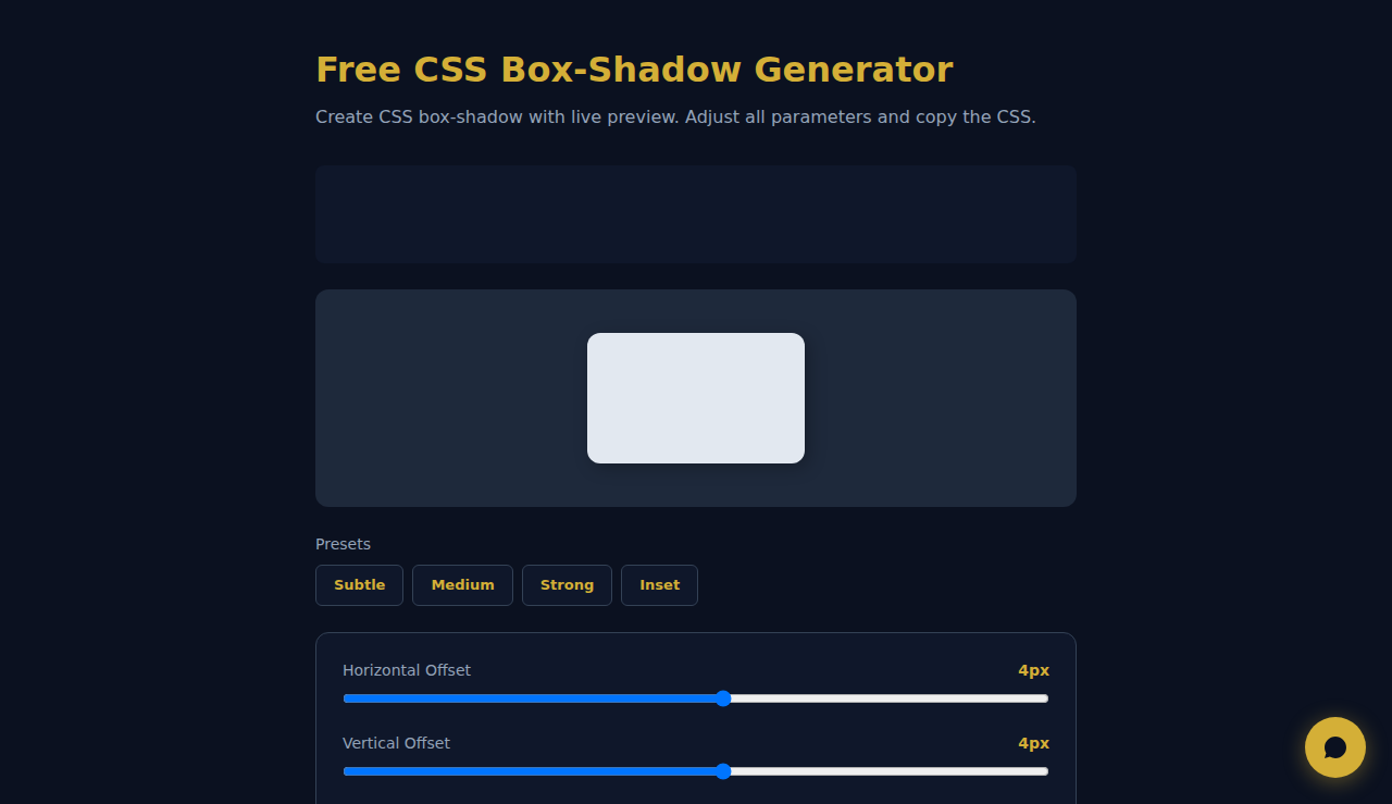
Cómo usar el generador de CSS Box-Shadow
Ajusta los controles de desplazamiento horizontal y vertical, radio de desenfoque, expansión, color y opacidad para crear la sombra perfecta. Activa inset para sombras internas. La vista previa en directo se actualiza al instante para que veas exactamente cómo quedará la sombra. Haz clic en Copiar CSS cuando estés conforme.
Cuándo usar sombras CSS box-shadow
- Añadir profundidad y elevación a tarjetas, botones y modales en el diseño de interfaces
- Crear efectos de neumorfismo o glasmorfismo con sombras inset
- Prototipar estados hover y respuestas interactivas para componentes web
Preguntas Frecuentes
¿Puedo usar varias box-shadow en un mismo elemento?
Sí. CSS permite valores box-shadow separados por comas. Genera cada sombra por separado con esta herramienta y luego combínalas en tu hoja de estilos para lograr efectos de profundidad en capas.
¿Cuál es la diferencia entre sombras inset y normales?
Las sombras normales aparecen fuera del elemento y crean un efecto elevado. Las sombras inset se dibujan dentro y dan un aspecto de pulsado, habitual en diseños neumórficos.
¿Esta herramienta guarda mis ajustes?
No. Todo el procesamiento ocurre por completo en tu navegador. No se guarda ni se envía nada a ningún servidor.
Todo se procesa localmente en tu navegador. Ningun dato se almacena o transmite.
Estas herramientas son gratis para siempre. SARA va más allá.
SARA es tu agente AI en WhatsApp: responde a clientes, gestiona reservas y hace seguimiento — 24/7, automáticamente. Pruébala gratis 14 días.
Empieza tu prueba gratis de 14 días →