Free CSS Box-Shadow Generator
Create CSS box-shadow with live preview. Adjust all parameters and copy the CSS.
Presets
CSS Output
box-shadow: 4px 4px 16px 0px rgba(0, 0, 0, 0.25);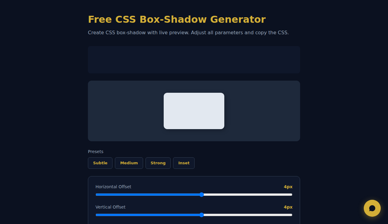
How to Use the CSS Box-Shadow Generator
Adjust the horizontal and vertical offset, blur radius, spread, color and opacity sliders to create your perfect shadow effect. Toggle inset for inner shadows. The live preview updates instantly so you can see exactly how your shadow will look. Click Copy CSS when satisfied.
When to Use CSS Box Shadows
- Adding depth and elevation to cards, buttons and modals in UI design
- Creating neumorphism or glassmorphism effects with inset shadows
- Prototyping hover states and interactive feedback for web components
Frequently Asked Questions
Can I use multiple box-shadows on one element?
Yes. CSS allows comma-separated box-shadow values. Generate each shadow separately with this tool, then combine them in your stylesheet for layered depth effects.
What is the difference between inset and regular shadows?
Regular shadows appear outside the element creating a raised effect. Inset shadows render inside, giving a pressed look commonly used in neumorphic designs.
Does this tool store my settings?
No. All processing happens entirely in your browser. Nothing is saved or sent to any server.
All processing happens locally in your browser. No data is stored or transmitted.
These tools are free forever. SARA takes it further.
SARA is your AI agent on WhatsApp: answers customers, takes bookings, follows up — 24/7, automatically. Try it free for 14 days.
Start your free 14-day trial →