Free CSS Border-Radius Generator
Set each corner individually, preview live and copy CSS instantly.
border-radius: 12px;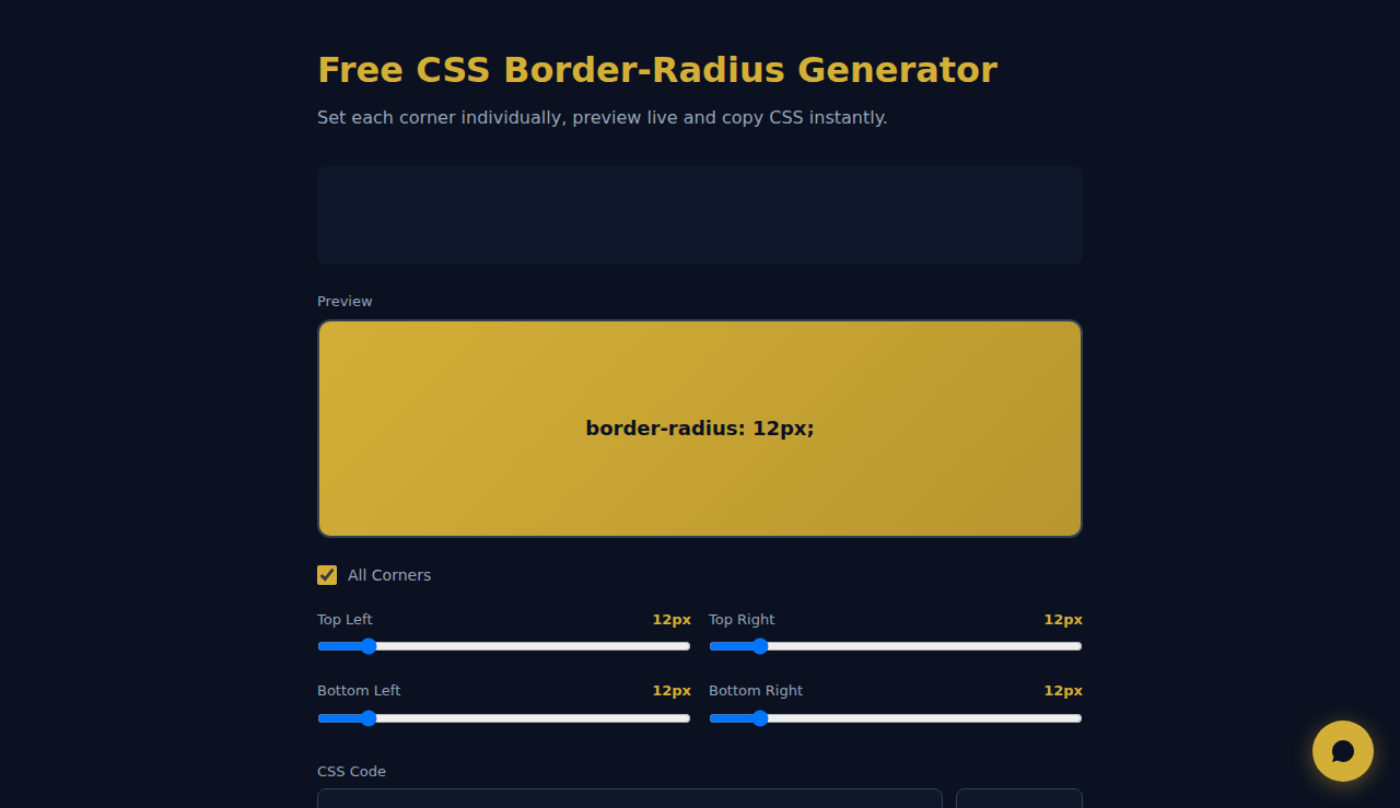
How It Works
Sets each corner of a CSS border-radius individually with live preview and one-click copy of the generated code. Includes presets for common shapes like Pill, Circle, and Subtle rounding. Everything runs in your browser — design UI elements visually and grab production-ready CSS instantly.
When to Use It
- Designing custom button shapes and card components with precise corner rounding.
- Creating pill shapes, circles, or organic blobs using advanced radius combinations.
- Prototyping UI elements and copying production-ready CSS into your stylesheet.
Frequently Asked Questions
Can I set different values per corner?
Yes. Four individual sliders for each corner. The All Corners slider sets all four at once, then you can fine-tune individually.
What presets are available?
Pill (fully rounded sides), Circle (50% radius), Subtle (8px gentle rounding), and more. Clicking a preset updates the preview and CSS code instantly.
Does the CSS work in all browsers?
Yes. border-radius is supported in all modern browsers — Chrome, Firefox, Safari, Edge, and mobile. No vendor prefixes needed. The generated code uses standard CSS3 syntax.
All processing happens in your browser. No data is sent to any server.
Ces outils sont gratuits pour toujours. SARA va plus loin.
SARA est votre agent IA sur WhatsApp : répond aux clients, prend les réservations, fait le suivi — 24/7, automatiquement. Essayez gratuitement 14 jours.
Démarrez votre essai gratuit de 14 jours →