Free Screen Resolution Detector
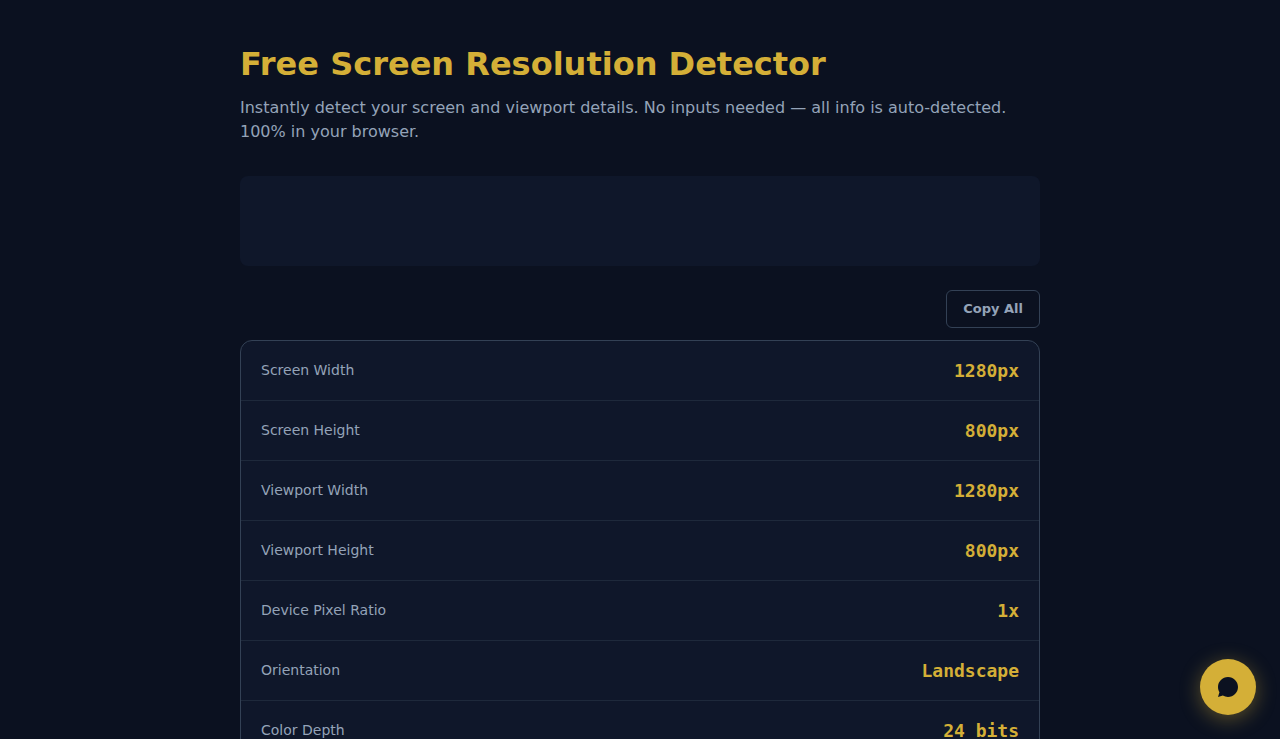
Instantly detect your screen and viewport details. No inputs needed — all info is auto-detected. 100% in your browser.
Detecting...
How It Works
The tool automatically detects your current screen resolution, viewport size, device pixel ratio (DPR), color depth, and orientation. No input needed — results appear instantly. See the difference between physical pixels and CSS pixels, which is critical for designing responsive websites and high-DPI displays like Retina screens.
When to Use It
- Web developers checking viewport dimensions and pixel ratio to debug responsive design breakpoints.
- Designers selecting the right image resolution and asset sizes for different screen densities (1x, 2x, 3x).
- Reporting your exact screen specifications to tech support when troubleshooting display or rendering issues.
Frequently Asked Questions
What is device pixel ratio (DPR)?
DPR is the ratio between physical pixels and CSS pixels. A DPR of 2 (common on Retina displays) means each CSS pixel is rendered using 2x2 physical pixels, resulting in sharper text and images. A 1920px screen with DPR 2 has a CSS viewport of 960px.
Why is my viewport smaller than my screen resolution?
The viewport excludes the browser chrome (address bar, tabs, scrollbar). Also, on high-DPI screens, CSS viewport is divided by the DPR. A 2560x1440 screen at DPR 2 shows a CSS viewport of approximately 1280x720. This is normal and is how responsive design works.
How do I test responsive design at different resolutions?
Use browser DevTools (F12) to toggle device emulation mode. This lets you simulate different viewport sizes and DPR values without needing multiple physical devices. Chrome DevTools also lets you add custom device profiles for specific testing scenarios.
All detection happens locally in your browser. No data is sent to any server.
These tools are free forever. SARA takes it further.
SARA is your AI agent on WhatsApp: answers customers, takes bookings, follows up — 24/7, automatically. Try it free for 14 days.
Start your free 14-day trial →